All the other stuff I have done.
Below are a few of my favorite designs over the years. Sometimes instead of designing a “post” I would use photos of my designs to make it stand out to different audiences. People can get bored with the same kind of posts, so its good to shake it up a bit.

As men sometimes do, this project I was told, “I dont know how I want it to look but this is what they are gonna have there.” So I took barbeque, men and competition to created this one. It became the yearly logo for their events and I loved the colors.
Make it stand out.
“Needs to be Christ-centered, with cookies, crafts and photos…. okay.
Another use of “put the activities all in one image.”
This had several ideas, but soon became a simplistic design with a bit of edge and texture. Using bold fonts to get the important stuff out and still included all the rest of the information. I created booklets out of this design, and I never thought I would like the simple look of this one. But loved it with all the different layouts.
Then the ladies said make it relaxing and fun.
We had a real bland primary color design and I decided to shake it up from a previous super hero theme I had used. I think it turned out much better and bit more fun for kids.
A shake up of an old bland design.
I got the promotional photos for our well known singer that I was allowed to use and realized I could do something with this. So this design comprises of three photos all Photoshopped into this and I was pretty happy with the results. Photoshop is a bit more detailed of a job but I knew that this was what I needed to use for this design.
Let’s combine lots of photos and see what that does.
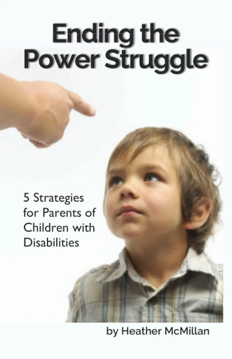
This customer said they would like a new design for their book cover. She clearly wanted to show that there can be a struggle but we can find comfort in her solutions she has found and described in her book. So we chose a color palette that would be soothing, but also give it more of a professional look. The dimensions were very specific so it proved to be a bit tricky with the uploader but we got it and the customer loved it.
Top left - Before
Large Image is the after published design.


